
Kustodian
Life
Role: UX Design Intern
Project Duration: 1 month
Solution: A web redesign that reimagines the emotionally complex space of legacy and estate planning. By embedding clarity, empathy, and trust across the experience, the solution makes sensitive processes feel intuitive and human-centered. Key interactions were thoughtfully crafted to balance emotional nuance with usability at every step. The result is a respectful flow that meets users with both functionally and emotionally.
Users engaging with legacy and estate services often encounter emotionally complex information presented in overly formal, fragmented, or text-heavy formats. This not only creates cognitive friction but also fails to build the trust required for such high-stake decisions. The challenge was to redesign the platform in a way that seamlessly integrates empathy, simplifies navigation, and communicates intent with clarity, enabling users to feel supported, not overwhelmed.
The Problem
As users landed on the platform, they were met with dense visuals, uneven spacing, and language that felt more procedural than personal. Important actions were often buried or unclear, leaving users unsure of what to do next, especially in moments that demanded clarity and emotional assurance. Inconsistencies in layout, tone, and design elements chipped away at trust, while the lack of accessible structure made the experience overwhelming with digital services. It became clear that for users to feel supported and confident, the experience had to evolve, not just visually, but emotionally and structurally
WHY WAS REDESIGNING ESSENTIAL?
The objective was to redesign the website in a way that seamlessly combined modern UI aesthetics with a deeply empathetic tone, creating a professional, trustworthy environment where users could access complex information with ease. The experience aimed to reduce cognitive effort, reinforce emotional safety, and build user confidence through clarity, consistency, and visual reassurance.
The Goal

Play
To explore the interface in greater detail, you can view the initial prototype linked above. It reflects the key design decisions, visual structure, and user flow developed during the early stage of the redesign.
FINAL DESIGN
This project became a deeply reflective process, one that pushed me to move beyond surface-level aesthetics and truly understand the relationship between context and interface. Learning to research and selectively draw inspiration from modern UI trends helped me assess not just what looks good, but what feels right for the user and the moment they’re in.
It trained my eye to align visual language with emotional needs, and taught me to design with sensitivity by balancing clarity, professionalism, and empathy. More than anything, it strengthened my ability to think contextually while staying grounded in user-centered principles.
A Reflective Journey

PLANNING
Evolving the Interface's Language
Inconsistent Design System
Lack of Visual Hierarchy
Emotionally Disengaged Language
Outdated Visual Design Language
Mismatched colors, button styles, and text alignment dilute brand identity and user trust.
Overwhelming headings, inconsistent CTA prominence, and poor alignment reduce clarity and scanability.
Generic or overly formal phrases miss empathy and action clarity.
Unstructured Content Flow
Redundant copy across pages and missing context confuses first-time users.
The use of shadowed CTAs, generic typography, and stock imagery creates a dated aesthetic that lacks the modern credibility and emotional relatability expected by users today.
Cluttered Layout and Visuals
Dense imagery (logos, backgrounds, QR codes) reduce focus and cause cognitive overload.
Unbalanced Spacing throughout the Layout
Some sections feel overly spaced out while others appear cramped, disrupting visual rhythm and making it harder for users to scan content comfortably and efficiently.
Observed Friction Areas
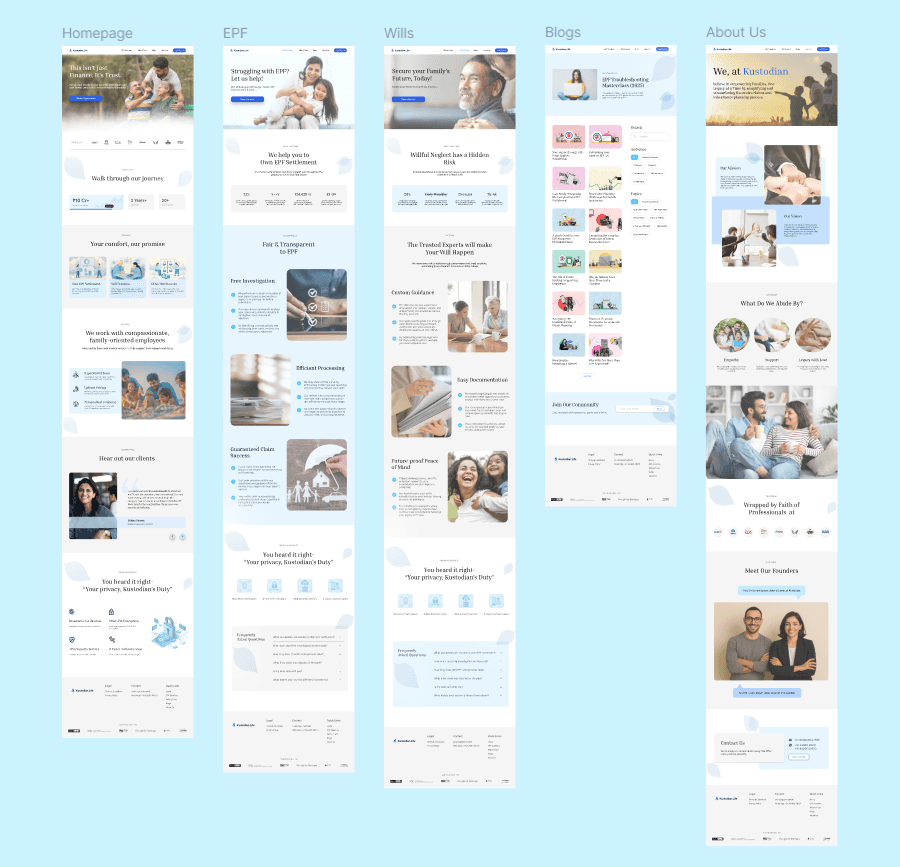
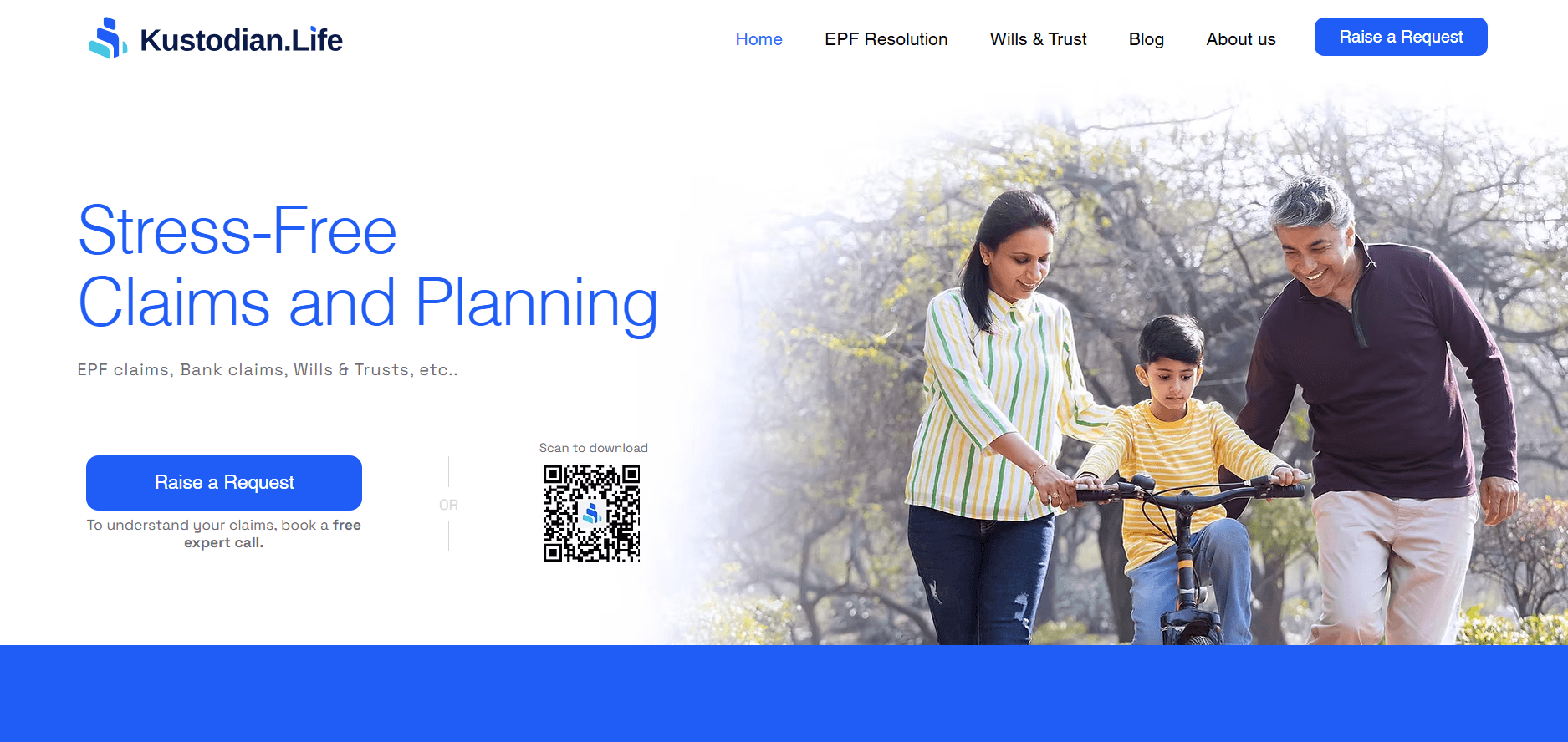
Homepage
Prioritized emotional reassurance by placing the value proposition and CTA above the fold, ensuring immediate clarity.
Integrated soft gradients and organic elements (like leaves) to create a calming, non-institutional first impression.
Restructured service blocks to guide users from why it matters to what they can do, supporting decision-making flow.
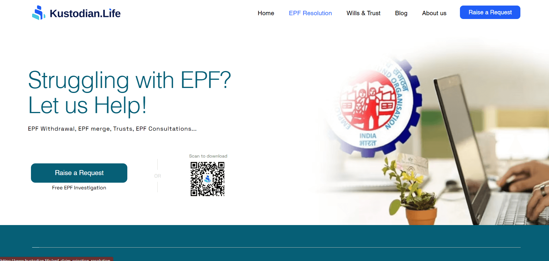
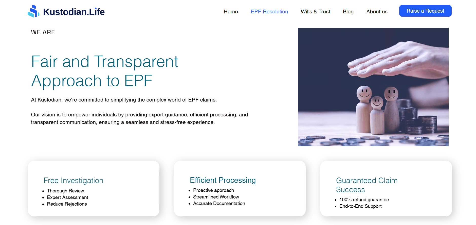
EPF Resolution Page
Elevated clarity by highlighting “Free Investigation” early, reducing cognitive hesitation and risk perception.
Translated complex service steps into simplified, sequential visual elements to improve comprehension.
Used whitespace strategically to pace dense content and prevent information overload, especially for first-time users.
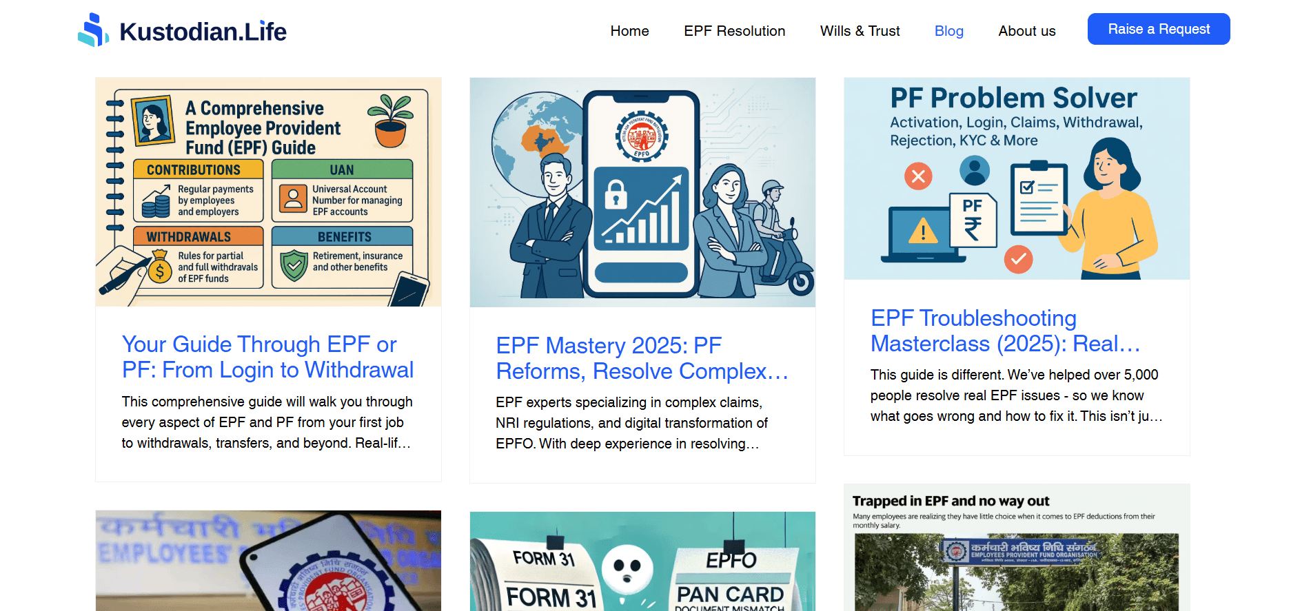
Blogs Page
Designed uniform blog cards to support visual scanning and reduce cognitive load across diverse content.
Streamlined color palette and thumbnail treatment for visual consistency and brand alignment.
Structured the layout to be future-ready for filters and categorization, improving long-term scalability.
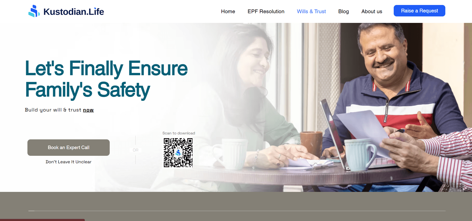
Wills & Trusts Page
Balanced emotional sensitivity with information depth by layering content progressively, from purpose to process.
Reframed legal jargon into empathetic, accessible language to reduce intimidation and support decision comfort.
Incorporated human imagery and reassuring tones to mirror the emotional weight of legacy planning.
About Us Page
Shifted the narrative tone from institutional to human, using people-centric visuals to build relatability and trust.
Reorganized content hierarchy to surface core values and intent before formal credentials, enhancing emotional connection.
Introduced subtle visual dividers and consistent spacing to support readability without overwhelming the user.
DESIGN DECISIONS


© 2023 Aakriti Srivastava
Research-forward. Design-focused. Let's build what matters.
Kustodian
Life
Role: UX Design Intern
Project Duration: 1 month
Solution: A web redesign that reimagines the emotionally complex space of legacy and estate planning. By embedding clarity, empathy, and trust across the experience, the solution makes sensitive processes feel intuitive and human-centered. Key interactions were thoughtfully crafted to balance emotional nuance with usability at every step. The result is a respectful flow that meets users with both functionally and emotionally.
The Problem
Users engaging with legacy and estate services often encounter emotionally complex information presented in overly formal, fragmented, or text-heavy formats. This not only creates cognitive friction but also fails to build the trust required for such high-stake decisions. The challenge was to redesign the platform in a way that seamlessly integrates empathy, simplifies navigation, and communicates intent with clarity, enabling users to feel supported, not overwhelmed.
Inconsistent Design System
Lack of Visual Hierarchy
Mismatched colors, button styles, and text alignment dilute brand identity and user trust.
Overwhelming headings, inconsistent CTA prominence, and poor alignment reduce clarity and scanability.
Unstructured Content Flow
Redundant copy across pages and missing context confuses first-time users.
Cluttered Layout and Visuals
Dense imagery (logos, backgrounds, QR codes) reduce focus and cause cognitive overload.
Emotionally Disengaged Language
Generic or overly formal phrases miss empathy and action clarity.
Outdated Visual Design Language
The use of shadowed CTAs, generic typography, and stock imagery creates a dated aesthetic that lacks the modern credibility and emotional relatability expected by users today.
Unbalanced Spacing throughout the Layout
Some sections feel overly spaced out while others appear cramped, disrupting visual rhythm and making it harder for users to scan content comfortably and efficiently.
Observed Friction Areas
WHY WAS REDESIGNING ESSENTIAL?
As users landed on the platform, they were met with dense visuals, uneven spacing, and language that felt more procedural than personal. Important actions were often buried or unclear, leaving users unsure of what to do next, especially in moments that demanded clarity and emotional assurance. Inconsistencies in layout, tone, and design elements chipped away at trust, while the lack of accessible structure made the experience overwhelming with digital services. It became clear that for users to feel supported and confident, the experience had to evolve, not just visually, but emotionally and structurally
The Goal
The objective was to redesign the website in a way that seamlessly combined modern UI aesthetics with a deeply empathetic tone, creating a professional, trustworthy environment where users could access complex information with ease. The experience aimed to reduce cognitive effort, reinforce emotional safety, and build user confidence through clarity, consistency, and visual reassurance.
Evolving the Interface's Language
PLANNING
FINAL DESIGN
To explore the interface in greater detail, you can view the initial prototype linked above. It reflects the key design decisions, visual structure, and user flow developed during the early stage of the redesign.
Homepage
Prioritized emotional reassurance by placing the value proposition and CTA above the fold, ensuring immediate clarity.
Integrated soft gradients and organic elements (like leaves) to create a calming, non-institutional first impression.
Restructured service blocks to guide users from why it matters to what they can do, supporting decision-making flow.
EPF Resolution Page
Elevated clarity by highlighting “Free Investigation” early, reducing cognitive hesitation and risk perception.
Translated complex service steps into simplified, sequential visual elements to improve comprehension.
Used whitespace strategically to pace dense content and prevent information overload, especially for first-time users.
Wills & Trusts Page
Balanced emotional sensitivity with information depth by layering content progressively, from purpose to process.
Reframed legal jargon into empathetic, accessible language to reduce intimidation and support decision comfort.
Incorporated human imagery and reassuring tones to mirror the emotional weight of legacy planning.
Blogs Page
Designed uniform blog cards to support visual scanning and reduce cognitive load across diverse content.
Streamlined color palette and thumbnail treatment for visual consistency and brand alignment.
Structured the layout to be future-ready for filters and categorization, improving long-term scalability.
About Us Page
Shifted the narrative tone from institutional to human, using people-centric visuals to build relatability and trust.
Reorganized content hierarchy to surface core values and intent before formal credentials, enhancing emotional connection.
Introduced subtle visual dividers and consistent spacing to support readability without overwhelming the user.
DESIGN DECISIONS
A Reflective Journey
This project became a deeply reflective process, one that pushed me to move beyond surface-level aesthetics and truly understand the relationship between context and interface. Learning to research and selectively draw inspiration from modern UI trends helped me assess not just what looks good, but what feels right for the user and the moment they’re in.
It trained my eye to align visual language with emotional needs, and taught me to design with sensitivity by balancing clarity, professionalism, and empathy. More than anything, it strengthened my ability to think contextually while staying grounded in user-centered principles.
© 2023 Aakriti Srivastava
Research-forward. Design-focused. Let's build what matters.
© 2023 Aakriti Srivastava
Research-forward. Design-focused. Let's build what matters.

Aakriti | UX Researcher & Designer
Kustodian
Life
Role: UX Design Intern
Project Duration: 1 month
Solution: A web redesign that reimagines the emotionally complex space of legacy and estate planning. By embedding clarity, empathy, and trust across the experience, the solution makes sensitive processes feel intuitive and human-centered. Key interactions were thoughtfully crafted to balance emotional nuance with usability at every step. The result is a respectful flow that meets users with both functionally and emotionally.
The Problem
Users engaging with legacy and estate services often encounter emotionally complex information presented in overly formal, fragmented, or text-heavy formats. This not only creates cognitive friction but also fails to build the trust required for such high-stake decisions. The challenge was to redesign the platform in a way that seamlessly integrates empathy, simplifies navigation, and communicates intent with clarity, enabling users to feel supported, not overwhelmed.
Lack of Visual Hierarchy
Unbalanced Spacing throughout the Layout
Some sections feel overly spaced out while others appear cramped, disrupting visual rhythm and making it harder for users to scan content comfortably and efficiently.
Overwhelming headings, inconsistent CTA prominence, and poor alignment reduce clarity and scanability.
Cluttered Layout and Visuals
Dense imagery (logos, backgrounds, QR codes) reduce focus and cause cognitive overload.
Inconsistent Design System
Mismatched colors, button styles, and text alignment dilute brand identity and user trust.
Unstructured Content Flow
Redundant copy across pages and missing context confuses first-time users.
Emotionally Disengaged Language
Generic or overly formal phrases miss empathy and action clarity.
Outdated Visual Design Language
The use of shadowed CTAs, generic typography, and stock imagery creates a dated aesthetic that lacks the modern credibility and emotional relatability expected by users today.
Observed Friction Areas
The Goal
The objective was to redesign the website in a way that seamlessly combined modern UI aesthetics with a deeply empathetic tone, creating a professional, trustworthy environment where users could access complex information with ease. The experience aimed to reduce cognitive effort, reinforce emotional safety, and build user confidence through clarity, consistency, and visual reassurance.
Evolving the Interface's Language
PLANNING
To explore the interface in greater detail, you can view the initial prototype linked above. It reflects the key design decisions, visual structure, and user flow developed during the early stage of the redesign.
© 2023 Aakriti Srivastava
Research-forward. Design-focused. Let's build what matters.
© 2023 Aakriti Srivastava
Research-forward. Design-focused. Let's build what matters.
WHY WAS REDESIGNING ESSENTIAL?
As users landed on the platform, they were met with dense visuals, uneven spacing, and language that felt more procedural than personal. Important actions were often buried or unclear, leaving users unsure of what to do next, especially in moments that demanded clarity and emotional assurance. Inconsistencies in layout, tone, and design elements chipped away at trust, while the lack of accessible structure made the experience overwhelming with digital services. It became clear that for users to feel supported and confident, the experience had to evolve, not just visually, but emotionally and structurally
DESIGN DECISIONS
About Us Page
Homepage
Prioritized emotional reassurance by placing the value proposition and CTA above the fold, ensuring immediate clarity.
Integrated soft gradients and organic elements (like leaves) to create a calming, non-institutional first impression.
Restructured service blocks to guide users from why it matters to what they can do, supporting decision-making flow.
EPF Resolution Page
Elevated clarity by highlighting “Free Investigation” early, reducing cognitive hesitation and risk perception.
Translated complex service steps into simplified, sequential visual elements to improve comprehension.
Used whitespace strategically to pace dense content and prevent information overload, especially for first-time users.
Wills & Trusts Page
Balanced emotional sensitivity with information depth by layering content progressively, from purpose to process.
Reframed legal jargon into empathetic, accessible language to reduce intimidation and support decision comfort.
Incorporated human imagery and reassuring tones to mirror the emotional weight of legacy planning.
Blogs Page
Designed uniform blog cards to support visual scanning and reduce cognitive load across diverse content.
Streamlined color palette and thumbnail treatment for visual consistency and brand alignment.
Structured the layout to be future-ready for filters and categorization, improving long-term scalability.
Shifted the narrative tone from institutional to human, using people-centric visuals to build relatability and trust.
Reorganized content hierarchy to surface core values and intent before formal credentials, enhancing emotional connection.
Introduced subtle visual dividers and consistent spacing to support readability without overwhelming the user.
A Reflective Journey
This project became a deeply reflective process, one that pushed me to move beyond surface-level aesthetics and truly understand the relationship between context and interface. Learning to research and selectively draw inspiration from modern UI trends helped me assess not just what looks good, but what feels right for the user and the moment they’re in.
It trained my eye to align visual language with emotional needs, and taught me to design with sensitivity by balancing clarity, professionalism, and empathy. More than anything, it strengthened my ability to think contextually while staying grounded in user-centered principles.